There is a distinction in UK confectionery retail that experienced buyers recognise instantly and that most brands discover only after spending significantly on packaging that doesn’t perform as commercially as its production cost suggested it should. The distinction is between packaging that communicates genuine premium quality and packaging that communicates expensive production without the underlying quality reasoning that makes premium positioning credible. These are not the same thing, and the gap between them is wider in the UK confectionery market than in most comparable product categories because British consumers who purchase premium confectionery as gifts have developed a sophisticated reading of quality signals that marketing investment alone doesn’t satisfy.
The expensive-looking packaging failure mode is more common than it might seem. A confectionery brand that invests in heavyweight rigid box construction, multiple finishing effects including foil stamping and spot UV, premium ribbon closure, and high-specification interior tissue can spend £3.50 to £5.00 per unit on packaging that a Fortnum and Mason buyer dismisses in thirty seconds and that a consumer handles in a Selfridges food hall, places back on the shelf, and doesn’t buy. The production cost is real. The premium signal isn’t. Understanding why these two outcomes diverge in the UK confectionery market, and what actually separates genuine premium presentation from its expensive approximation, changes how confectionery brands brief packaging development and what they invest in when they make that investment.
What Does Premium Actually Mean in UK Confectionery Packaging
The meaning of premium in UK confectionery packaging isn’t a fixed aesthetic standard that can be replicated through specification matching. It’s a communication outcome that emerges from the coherence between what the packaging looks like, what it feels like, what it contains, and what the brand behind it represents in the consumer’s cultural understanding of quality confectionery.
British consumer culture has a long and specific relationship with premium confectionery that creates a quality reference framework most UK shoppers apply without consciously accessing it. The gold standard of British premium confectionery presentation is Fortnum and Mason, whose packaging communicates centuries of considered tradition through choices that are specific rather than generic: the particular duck egg blue that belongs to no other brand, the restrained typography that hasn’t needed to shout for decades, the ribbon quality that opens with resistance rather than ease. This reference framework means that UK consumers evaluating any premium confectionery packaging are implicitly comparing it against a quality tradition whose signals are precise rather than general.
Premium presentation in this context communicates that specific choices were made for specific reasons rather than that expensive materials were applied without reference to what they communicate individually and collectively. A rigid box in a colour precisely calibrated to the brand’s seasonal palette communicates a specific choice. The same box in a colour chosen because it photographed well or because it was the supplier’s standard option communicates the absence of a specific choice. The material difference between these two outcomes may be negligible. The quality signal difference is significant because the UK consumer whose reference framework includes genuine premium confectionery reads packaging as evidence of intentionality rather than as evidence of expenditure.
Why Finishing Effects Create Expensive-Looking Rather Than Premium-Looking Packaging
The most consistent way that UK confectionery brands create expensive-looking packaging that fails to communicate premium is through the accumulation of finishing effects whose individual application decisions weren’t made with reference to the effect they create in combination or to the quality signal each creates in the context of the specific brand and product.
Foil stamping, spot UV, embossing, debossing, soft-touch lamination, gloss lamination, ribbon closure, and magnetic closure are all finishing effects whose individual application to confectionery packaging can contribute to a premium signal when used with a clear understanding of what each contributes and why. Their simultaneous application to the same packaging surface, without this clarity of purpose for each individual decision, creates visual and tactile noise that registers as expensive rather than considered. The British consumer response to this noise is the same response that British professional culture applies to over-dressed social occasions: an awareness that effort has been made that exceeds what the context warrants, which communicates insecurity rather than confidence.
The finishing effect hierarchy that creates genuine premium signal in UK confectionery packaging concentrates investment in the single effect that most powerfully communicates the specific quality attribute the brand wants to own, and executes that effect at the highest available quality rather than distributing investment across multiple effects executed at standard quality. A confectionery brand whose quality positioning is grounded in heritage and tradition invests in debossed brand marks executed with the dimensional depth that communicates material permanence, and achieves a quality signal through this single effect that multiple simultaneously applied effects of lesser execution quality don’t replicate. A confectionery brand whose quality positioning is grounded in contemporary luxury invests in soft-touch matte lamination in a colour whose precision is maintained across the full surface without variation, and achieves a quality signal through this material choice and its flawless execution that decoration applied on top of a less precisely specified surface undermines.
How Material Weight Creates or Destroys Premium Perception
The weight of packaging materials in UK premium confectionery creates quality signals that operate before any visual assessment begins, and the specific weight properties that communicate premium in confectionery packaging differ from those in adjacent luxury categories in ways that confectionery-specific material specification needs to address.
Rigid box board weight in UK premium confectionery packaging communicates through the resistance of the lid to opening rather than through the box’s static weight in hand, and this resistance quality is determined by the relationship between board weight, board grade, and the precision of the lid-to-base fit rather than by board weight alone. A lid whose resistance during opening is consistent and controlled, releasing at a defined point with a smooth motion rather than releasing suddenly after resistance that builds irregularly, communicates engineering precision that the consumer reads as quality without consciously identifying the mechanism. This specific quality of controlled lid resistance is what distinguishes handmade British chocolate brand packaging that achieves genuine premium signal from packaging whose board weight is equivalent but whose lid fit precision doesn’t create the same controlled opening experience.
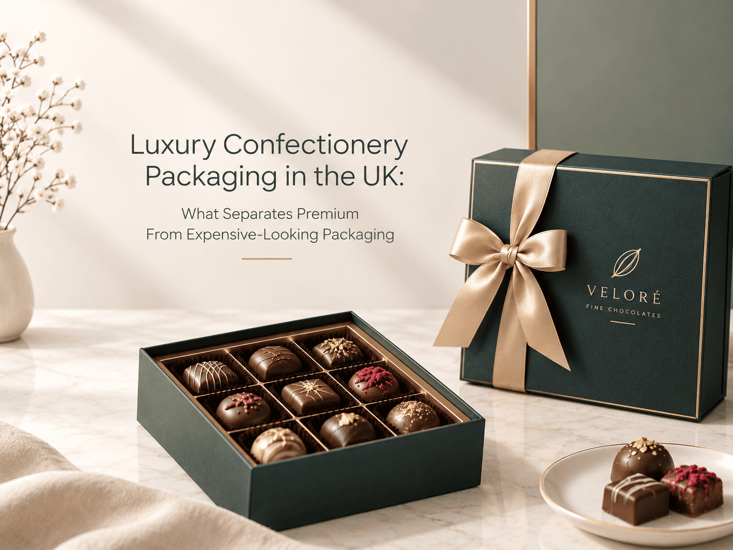
The interior material weight and surface quality in premium confectionery packaging creates the quality signal at the highest-attention moment of the product encounter, when the lid opens and the confectionery is revealed. Interior materials including rigid foam trays covered in suedette, thermoformed plastic trays whose cavity dimensions match the confectionery precisely, individual paper cups whose weight and surface quality reflect the confectionery’s price point, and tissue whose weight sits in the range where it holds its fold without collapsing all contribute to this moment’s quality signal through their specific material properties rather than through their general category.
The quality contradiction that most commonly undermines expensive confectionery packaging in the UK market is the mismatch between exterior material weight and interior material weight. An exterior rigid box whose board weight communicates substantial construction that opens to reveal confectionery sitting on a thin corrugated paper tray covered in basic polyester fabric creates a quality promise whose interior fulfilment fails. This is the most commercial specific way that expensive-looking packaging fails to convert in UK premium confectionery retail: the exterior passes the first quality assessment and the interior fails the second, and the consumer who has invested attention in opening the packaging to reach this moment of failure records a trust deficit that the exterior presentation created the expectation for.
What Colour Decisions Communicate in UK Luxury Confectionery Packaging
Colour in UK luxury confectionery packaging communicates with a specificity that the general premium colour convention of dark, muted, and sophisticated doesn’t fully capture, because the UK luxury confectionery market has developed colour associations precise enough that specific colour choices carry specific quality signals rather than generic premium ones.
Deep jewel tones including burgundy, navy, forest green, and rich purple have established themselves as the dominant premium palette in UK confectionery packaging, appearing across enough premium producers that they function as category membership signals rather than brand differentiation signals. A confectionery brand entering this colour territory is communicating premium membership in the category rather than premium distinctiveness within it, which is commercially valuable for first placement in the category but insufficient for brand equity development in a market where category awareness is already high among the target consumer.
The colour decision that creates premium distinctiveness rather than category membership requires a specific hue within the premium territory that belongs to the brand rather than to the category, executed with a precision that makes the relationship between colour and brand unmistakable. Fortnum and Mason’s duck egg blue doesn’t communicate premium because blue is premium. It communicates premium because that specific blue is Fortnum and Mason’s, and the consistency with which it appears across all packaging, across all occasions, and across all product lines makes it recognisable as a brand property rather than a colour choice. This brand colour ownership requires the production consistency that Pantone specification and Delta E tolerance management provide, rather than the colour approximation that CMYK reproduction without these controls delivers.
Colour seasonality in UK luxury confectionery packaging creates a specific commercial challenge that premium positioning makes more acute rather than less. UK confectionery gifting concentrates heavily in seasonal occasions including Christmas, Valentine’s Day, Easter, and Mother’s Day, each of which has established colour associations that seasonal packaging variants activate to signal occasion relevance. The commercial tension between maintaining brand colour ownership and activating occasion colour associations creates a packaging system challenge whose resolution through sleeve, ribbon, or tissue variation rather than full structural colour change preserves brand consistency while accommodating seasonal communication.
What Interior Presentation Architecture Communicates About Product Quality
The interior presentation architecture of UK luxury confectionery packaging creates the quality signal that determines purchase repetition in ways that exterior presentation determines purchase initiation but can’t sustain across a relationship where the consumer has already experienced the exterior. Interior architecture is therefore the quality dimension that matters most for the customer retention that premium confectionery brands depend on commercially, and it’s the dimension that receives the least deliberate specification attention in most packaging briefs.
Product presentation height within the interior architecture determines how confectionery reveals itself when the lid is raised, and this reveal moment is the highest-attention point in the consumer’s interaction with the packaging. Confectionery presented at a height that brings individual pieces to or above the box rim at lid opening reveals with visual generosity that communicates product abundance. Confectionery presented in an interior that sits below the rim at opening creates a looking-down-into-the-box experience whose visual impression of the product before it’s handled is less generous than the same product at higher presentation height.
Cavity precision in interior presentation trays determines how firmly individual pieces are held in position during transit and how they present in the cavity at opening. A cavity whose dimensions match the confectionery piece precisely presents each piece as positioned rather than dropped, and this positional control communicates the same design intentionality that exterior finishing effects communicate when they’re executed precisely rather than approximately. A cavity oversized for its intended piece creates a settled appearance in transit that presents the confectionery as having shifted rather than as having been placed, undermining the reveal moment whose quality signal the exterior packaging created the expectation for.
The spacing between confectionery pieces in interior presentation trays affects the visual luxury of the interior in ways that go beyond simply fitting the right number of pieces in the available area. Generous spacing that gives each piece visual breathing room communicates premium through the spatial convention that luxury retail applies across product categories from fine jewellery to premium stationery. Tight spacing that maximises piece count within available area communicates value through quantity rather than premium through consideration, a communication that contradicts the quality positioning that luxury confectionery pricing requires the packaging to support.
How UK Consumer Gifting Culture Shapes Premium Confectionery Packaging Requirements
The gifting context in which the majority of UK premium confectionery packaging is purchased creates requirements that packaging developed for self-purchase consumption doesn’t anticipate, because the gifting purchase is evaluated by the giver against a different set of quality criteria than the consumption experience evaluates by the recipient.
The giver’s quality assessment happens at the point of purchase in the retail environment, and it’s primarily a visual and tactile assessment conducted under retail lighting conditions within the time pressure of a shopping expedition whose confectionery purchase may be one of several decisions being made. The quality signals the giver is assessing are the signals that communicate to a third party that this is a good gift rather than the signals that communicate to the giver directly that the product is worth its price. These are meaningfully different evaluation frameworks: the giver is assessing how the packaging will communicate quality and care to the recipient rather than how it satisfies the giver’s own quality preferences.
This gifting assessment framework means that premium confectionery packaging in the UK market needs to communicate quality legibly to a giver who may not be the brand’s primary target consumer and who is assessing the packaging’s gift-adequacy rather than its product-quality alignment. The packaging needs to pass the gift-adequate assessment quickly and reliably under a range of retail conditions, which requires the quality signals it employs to be culturally legible across the full range of consumers who might purchase the product as a gift rather than only to the specialist consumer audience whose preferences shaped the brand’s quality positioning.
Aly Packaging UK works with confectionery brands developing luxury packaging whose premium signals are precisely calibrated to the UK gifting and retail context rather than approximated through expensive but unconsidered specification choices. Contact our UK team at sales@alypackaging.com or call 1-844-259-7225 to discuss your luxury confectionery packaging brief.