
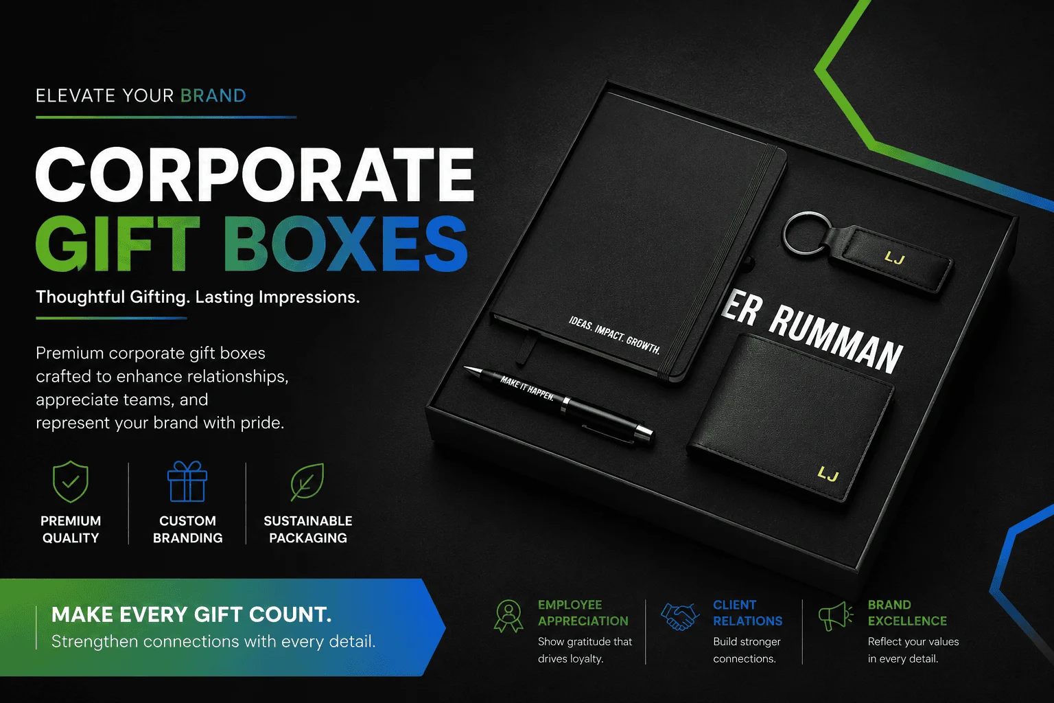
There is a particular kind of packaging confidence that British business culture recognises immediately and responds to warmly, and it has almost nothing to do with how much the packaging visibly cost to produce. A luxury corporate gift box that arrives in a restrained cloth-bound rigid case with a single debossed brand mark, a precisely weighted magnetic closure, and tissue paper in a tone that sits quietly against the box interior communicates something that an elaborately decorated box of twice the monetary value doesn’t. It communicates that the sender understands quality well enough not to explain it. That kind of confidence, expressed through what a brand chose not to put on its packaging rather than what it chose to include, is the specific signal that British corporate recipients read as premium and that packaging designed without understanding British cultural conventions frequently fails to produce.
This isn’t a universal principle. It’s a specifically British one, and brands that import corporate gift packaging conventions from American or continental European markets where extravagance signals generosity rather than uncertainty tend to discover the mismatch through recipient reactions that are politely positive but not the warmly impressed responses the programme was designed to generate. Understanding why British corporate culture reads restraint as confidence, and what packaging decisions translate that cultural understanding into physical form, is the practical value this guide offers for any business commissioning luxury corporate gift boxes for UK relationships.
Why British Corporate Culture Reads Restraint as Confidence
The cultural association between restraint and quality in British professional life runs through enough institutions and enough decades to have become genuinely embedded rather than merely fashionable. The finest British tailoring doesn’t announce itself through visible decoration. The most prestigious British universities don’t need elaborate visual identity systems because their names carry sufficient weight without them. The most respected British professional services firms maintain visual identities so stripped back they would read as underdesigned in markets where brand presence requires more explicit communication.
This cultural pattern creates a specific reading of luxury packaging among British corporate recipients that differs from the reading that equivalent packaging would receive in most other markets. Elaborate decoration, multiple finish effects layered onto a single surface, oversized proportions relative to contents, and aggressive use of brand colour across every available panel all communicate something to a British corporate recipient that they don’t communicate in markets where these choices signal investment and care. In British corporate culture they communicate effort, which is subtly but meaningfully different from quality. Effort implies that the sender needed to work hard to create an impression. Quality implies that the impression is simply what this brand produces naturally.
Restraint communicates the opposite. A packaging choice that could have included foil stamping but chose debossing instead signals that the brand is confident enough in its identity not to reach for the most visually assertive option available. A colour palette that could have been bolder but chose a considered muted tone signals that the brand understands sophistication well enough to work within it rather than over it. These choices don’t look cheaper to British corporate recipients. They look more assured, which in British professional culture is the more valuable signal.
The distinction between effort and assurance as quality signals also explains why British corporate gift packaging that performs well tends to age better in recipient memory than packaging that made an immediate visual impact. Recipients who describe a gift box months later as having been quietly impressive are describing assurance. Recipients who describe a gift box as having been striking but who struggle to articulate what specifically impressed them are describing effort that didn’t connect to a substantive quality signal. The first description is what luxury corporate gifting programmes exist to produce, and it requires understanding British cultural conventions rather than applying globally generic luxury packaging conventions.
What Materials Carry Premium Signal in British Corporate Gifting
The material choices available for luxury corporate gift boxes carry different cultural weights in British professional contexts, and understanding which materials the British corporate market has already associated with quality allows packaging decisions to build on established associations rather than working against them.
Cloth-bound rigid box exteriors, using linen, buckram, or silk-effect fabric coverings applied over greyboard, carry cultural associations with British quality goods that run through fine bookbinding, traditional stationery, and the kind of archival product quality that connotes permanence. A gift box covered in a precisely woven linen fabric communicates that the sender thought about the box lasting beyond its immediate function, which is a distinctly different quality signal from a box whose presentation is impressive at first sight but whose material weight doesn’t suggest longevity. These fabric coverings are available in a range of weights and weave densities that affect both appearance and tactile quality, with heavier weight linens and tighter weave constructions reading as more premium through the combination of visual texture and resistance under finger pressure.
Paper-covered rigid boxes in matte stocks carry their own quality associations that differ from cloth but are no less established in British corporate gifting culture. A rigid box covered in a deep, precisely matte paper with no surface variation or coating shine communicates quality through the controlled uniformity of its surface, a manufacturing precision signal that high-quality matte papers carry in a way that standard gloss or satin-coated alternatives don’t. The specific matte quality that reads as premium in British corporate culture tends toward darker, more saturated tones rather than the lighter, more pastel matte palettes that read as premium in beauty and lifestyle packaging, reflecting the more formal colour associations of professional British contexts.
Natural and tactile materials have gained specific traction in British corporate gifting over the past several years in ways that align with broader shifts in British professional culture toward sustainability credentials as quality signals. Unbleached linen, recycled fibre rigid box coverings, and forest-certified paper stocks communicate environmental consideration in a way that has moved from being a secondary quality signal to a primary one for a meaningful proportion of British corporate recipients who apply sustainability criteria to how they assess the organisations they receive gifts from. This shift means that material choices communicating environmental credibility now carry premium signal in British corporate contexts they previously didn’t reach, extending the sustainability credential conversation from consumer packaging into corporate gifting territory where it has specific cultural resonance.
How Finishing Decisions Communicate Confidence or Uncertainty
The finishing effects applied to luxury corporate gift boxes are the most immediately perceptible quality signals recipients process, and they’re also the decisions where the difference between restraint communicating confidence and restraint communicating underinvestment is determined. Getting this distinction right requires understanding what each finishing choice signals in British corporate culture and how combinations of finishing effects read differently from individual applications.
Debossing, which creates dimensional depth in the box covering material through pressure without the addition of ink or foil, is the finishing technique most consistently associated with British corporate quality positioning across the packaging categories that UK professional culture has established conventions around. Debossed brand identification on a cloth or quality paper-covered rigid box reads as the most confident available choice precisely because it adds nothing to the surface except dimension. There is no colour, no metallic reflection, no secondary material introduction. The brand mark is present because the material itself was shaped to make it present, which communicates a relationship between brand and material that more assertive finishing techniques don’t achieve.
Hot foil stamping in gold or silver carries premium associations in British corporate culture that are well established but sit differently depending on scale, placement, and the relationship between the foiled element and the surrounding surface. A precisely sized foil-stamped brand mark on a deep matte surface reads as confident and considered because the foil’s scale is proportionate to the brand mark’s communicative function rather than to the available panel area. Foil stamping that covers significant panel area, uses multiple foil colours, or introduces decorative foiled elements beyond brand identification reads as decorative rather than assured, a distinction British corporate recipients make with sufficient consistency that understanding the difference matters for programme outcome.
Spot UV applied to matte lamination creates the highest contrast finish effect in the luxury packaging repertoire, and its appropriateness in British corporate gifting depends entirely on how it’s used rather than on the technique itself. Spot UV that precisely outlines a logo or a single graphic element on a matte surface, creating a clear but contained contrast effect, reads as technically precise in a way that signals quality through manufacturing discipline. Spot UV applied across large surface areas, or used to create extensive decorative patterns, introduces visual complexity that reads as busy against the restraint that British corporate culture associates with premium.
Soft-touch matte lamination deserves specific mention because its tactile quality, the subtle velvety resistance it creates under finger pressure, operates on a sensory register that other finishing techniques don’t access in the same way. Recipients handling a soft-touch laminated rigid box experience a surface quality that communicates premium before any visual assessment begins, which is particularly valuable in corporate gifting contexts where the box is handled before it’s examined visually, as when it arrives in a padded envelope or a carrier bag at a professional office environment.
What Interior Presentation Decisions Determine the Moment That Matters Most
The interior of a luxury corporate gift box is experienced at the moment of highest emotional attention in the gifting transaction, the point immediately after the lid is raised and before the recipient has processed what they’re looking at. Everything that happens in this moment is determined by decisions made during packaging development that most gifting programme briefs address less carefully than exterior specification, despite the interior being the environment the recipient inhabits for the longest portion of their gift experience.
Tissue paper in luxury corporate gift boxes carries cultural weight that its unit cost doesn’t suggest. The specific quality of tissue that reads as considered in British corporate gifting sits in a weight range where the paper holds its fold without collapsing but falls with enough softness to create the impression of wrapping rather than packing. Tissue that’s too light creates a flimsy impression inconsistent with the exterior quality signal. Tissue that’s too heavy reads as padding rather than presentation. The colour relationship between tissue and box interior is where most gifting programmes make their most avoidable interior presentation error, by introducing a tissue colour that either matches the box too exactly, creating visual monotony, or contrasts too strongly, creating a colour clash that reads as unresolved rather than considered.
Product presentation height within the box interior affects how the gift reveals itself when the lid is raised, and this reveal moment is worth designing deliberately rather than accepting whatever height the interior dimensions produce naturally. A gift that sits at or near the rim of the interior cavity reveals itself fully and immediately upon lid opening, creating a complete visual presentation from the first moment. A gift that sits lower in the cavity requires the recipient to look down into the box to see it, reducing the drama of the reveal moment and creating a spatial relationship between gift and box that reads as imprecise rather than designed.
Insert design and quality in British corporate gift boxes benefits from the same restraint principle that exterior specification follows. A single quality insert card in a weight and colour that sits quietly against the tissue, printed with restrained typography and a concise personal message, completes the interior presentation without competing with the gift itself. Multiple inserts, decorative tissue layers, branded void fill material, and additional cards or enclosures create an interior that feels busy at exactly the moment when generous space and considered simplicity would communicate premium more effectively.
How Brand Colour Decisions in Corporate Gift Boxes Affect British Corporate Reception
Brand colour application across luxury corporate gift boxes creates specific reception dynamics in British professional culture that differ from consumer packaging colour conventions, and gifting programmes that apply consumer colour logic to corporate gifting contexts frequently produce packaging whose reception doesn’t match the programme’s intent.
Full brand colour application across the exterior of a luxury gift box, where the primary brand colour covers all exterior panels, creates a strongly branded presentation that communicates differently in corporate gifting than it does on retail shelving. On retail shelving, full brand colour coverage builds recognition and visual presence in a competitive environment where the packaging needs to identify itself against competing products. In a corporate gifting context, full brand colour coverage communicates that the sender’s brand identity takes priority over the recipient’s experience of receiving the gift, a hierarchy that reads as commercially calculating in British professional culture where the best corporate gifts communicate generosity rather than brand leverage.
Restrained brand colour application, using the primary brand colour as an accent within a neutral or muted primary palette, creates a presentation that reads as considered rather than calculating. A gift box whose primary exterior colour is a deep charcoal or warm natural tone, with brand colour appearing only in the tissue, the ribbon, or the insert card, communicates that the brand is confident enough in its identity to hold it lightly rather than asserting it across every available surface. This confidence is precisely the signal that British corporate recipients associate with organisations mature enough to understand that the best gifting communicates care for the recipient rather than visibility for the sender.
Tonal colour relationships within a luxury gift box, where exterior covering, tissue, ribbon, and interior lining sit in a considered colour family rather than in contrasting colours, create a visual coherence that reads as precisely designed rather than assembled from available options. Tonal design requires more considered colour specification than contrasting design because the relationships between closely related colours are more visible and more sensitive to slight differences, but the resulting presentation communicates a level of design precision that British corporate recipients consistently associate with genuine quality rather than effective decoration.
What This Means for Briefing a Luxury Corporate Gift Box Supplier
Translating an understanding of British corporate packaging culture into a supplier brief requires communicating the cultural intent behind specification decisions rather than specification decisions alone. A supplier who understands that a brief is asking for restraint as a cultural quality signal makes different judgment calls at every ambiguity point in production than a supplier who is simply executing a list of material and finishing specifications without understanding why those specific choices were made.
Briefing that describes the recipient context, the professional relationships the boxes are going to, the positioning the sending organisation wants to communicate, and the cultural conventions the packaging needs to work within gives a supplier the framework for making production decisions aligned with programme intent. Briefing that describes only materials, dimensions, and finishing effects without cultural context produces technically accurate packaging whose cultural reading may not match what the programme required.
Physical sample approval before production commitment is particularly important for luxury corporate gift boxes targeting British cultural conventions because the specific material qualities, finishing precision, and colour relationships that determine whether a box reads as assured or merely expensive in British professional culture are impossible to assess from digital proofs. A physical sample evaluated by someone with genuine familiarity with British corporate gifting conventions provides the verification that specification decisions have produced the intended cultural signal before production investment is committed.
Aly Packaging UK produces luxury corporate gift boxes for UK business gifting programmes, with rigid box construction, cloth and paper covering options, debossing, foil stamping, and interior presentation specification suited to British corporate positioning requirements. Contact our UK team at sales@alypackaging.com or call 1-844-259-7225 to discuss your corporate gifting packaging requirements.


